


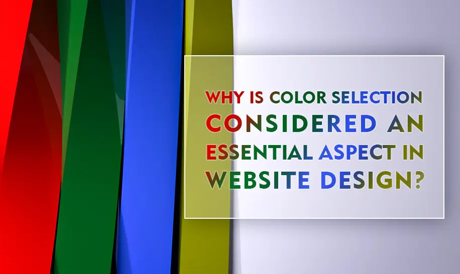
Why is color selection considered an essential aspect in website design?
In the realm of modern web design, color selection emerges as a pivotal element that goes far beyond mere aesthetics. Colors wield considerable power, significantly influencing user experience, brand recognition, and overall website effectiveness. This article delves into the multifaceted reasons why a strategic approach to color is indispensable for creating impactful and engaging websites, focusing on aspects like visual appeal, branding, user experience, and more. Understanding the principles of color psychology and employing them thoughtfully can dramatically enhance a website's performance and leave a lasting impression on visitors.
Elevating Visual Appeal and Fortifying Branding Through Color
Colors are instrumental in crafting an attractive and visually stimulating website that instantly grabs user attention. They possess the ability to evoke emotions, establish a distinct tone, and forge a unique brand identity. Consistent and strategic use of colors across a website not only reinforces brand recognition but also makes the site more memorable in the minds of its audience. Thoughtful color palettes can set a brand apart in a competitive digital landscape, ensuring it remains etched in the memory of potential customers.
Optimizing Communication, Navigation, and User Experience with Strategic Color Use
Colors serve as potent tools for conveying meaning and communicating messages effectively. Different colors evoke varied emotions and associations, enabling web designers to guide users' attention, spotlight crucial elements, and elevate the overall user experience. For instance, warm colors like red and orange can instill a sense of urgency or excitement, ideal for calls to action, while cool colors like blue and green convey calmness and trustworthiness, perfect for establishing credibility. By strategically employing color, websites can ensure clear communication and intuitive navigation.
Ensuring Superior Readability, Enhanced Accessibility, and Inclusivity Through Color Choices
The selection of colors in website design is paramount for guaranteeing optimal readability and accessibility for all users. High contrast between text and background colors is vital, particularly for individuals with visual impairments or color blindness. Adhering to accessibility standards in color choices ensures that a website is inclusive and usable by a broader audience, fostering a positive and equitable user experience. This approach not only enhances usability but also demonstrates a commitment to inclusivity.
Fostering Consistency, Streamlining Navigation, and Improving User Orientation Through Color
Colors play a crucial role in establishing a consistent visual hierarchy and facilitating seamless navigation throughout a website. By implementing a cohesive color scheme, designers can aid users in comprehending the site's structure, distinguishing between different sections or categories, and navigating with ease. Colors can also highlight interactive elements like buttons or links, making them more noticeable and intuitive, thus enhancing user orientation and satisfaction.
Cultivating Positive Brand Perception, Building Trust, and Enhancing Credibility Through Color
Colors significantly influence how users perceive a brand or website. Each color is associated with distinct qualities and emotions; for example, blue is often linked to trust and reliability, while yellow evokes feelings of happiness and optimism. By carefully selecting colors that resonate with the brand's values and target audience, web designers can cultivate a positive brand perception, foster trust, and enhance credibility, thereby strengthening the brand's relationship with its users.
Decoding the Psychological Impact of Colors on Website Visitors
Colors have a profound psychological impact, influencing emotions, perceptions, and behaviors. Understanding these effects is crucial for creating effective website designs.
-
Red: Associated with energy, passion, and excitement. Red can create a sense of urgency, making it ideal for call-to-action buttons and highlighting important announcements. However, it should be used sparingly as it can also be perceived as aggressive or overwhelming. In marketing, red is often used to stimulate appetite and draw attention.
-
Green: Symbolizes growth, health, and nature. Green is often used to create a calming and reassuring effect, making it suitable for websites related to health, wellness, and environmental sustainability. It conveys a sense of balance and harmony, making it a popular choice for brands that want to be seen as eco-friendly and responsible.
-
Blue: Represents trust, stability, and reliability. Blue is frequently used by corporate, financial, and government websites to convey a sense of security and professionalism. It is associated with calmness and serenity, making it a good choice for websites that want to build trust and credibility.
-
Yellow: Conveys positivity, optimism, and happiness. Yellow is often used to attract attention and create a cheerful atmosphere. It is suitable for websites that aim to uplift users' spirits and promote a sense of fun and creativity. However, it should be used carefully as it can also be perceived as overwhelming or cheap if overused.
-
Black: Emanates sophistication, elegance, and power. Black is often used by luxury brands to create a sense of exclusivity and high-end quality. It can also convey a sense of mystery and intrigue, making it suitable for websites that want to create a bold and dramatic impression. However, it should be balanced with lighter colors to avoid creating a gloomy or depressing atmosphere.
-
White: Symbolizes purity, cleanliness, and simplicity. White is often used to create a minimalist and modern design, allowing other elements to stand out. It conveys a sense of clarity and openness, making it a good choice for websites that want to create a clean and uncluttered user experience.
-
Purple: Associated with creativity, royalty, and spirituality. Purple can create a sense of luxury and sophistication, making it suitable for websites related to art, fashion, and beauty. It is also associated with imagination and intuition, making it a good choice for brands that want to be seen as innovative and visionary.
Conclusion: Harnessing the Power of Color for Optimal Website Impact
In conclusion, color selection is a cornerstone of effective website design, influencing visual appeal, communication, readability, navigation, and overall user experience. Thoughtful selection and implementation of colors enhance a website's aesthetics, brand identity, and user engagement. By understanding and leveraging the psychological impact of colors, web designers can create compelling digital experiences that resonate with their target audience, driving success and fostering lasting connections. High search keywords such as "website color schemes," "color psychology in web design," and "brand colors" are essential considerations for optimizing online visibility and attracting the right audience.