


A responsive navigation menu is essential for ensuring smooth and user-friendly navigation across devices. The way dropdown menus behave on desktop and mobile can significantly impact usability.
In this tutorial, we will:
This guide is perfect for developers looking to create a simple, responsive, and accessible navigation menu.
The HTML structure remains the same, defining a navigation bar with dropdown menus.
<!DOCTYPE html>
<html lang="en">
<head>
<meta charset="UTF-8">
<meta name="viewport" content="width=device-width, initial-scale=1.0">
<title>Responsive Dropdown Navigation</title>
<link rel="stylesheet" href="style.css">
<script src="https://code.jquery.com/jquery-3.6.0.min.js"></script>
<script src="script.js" defer></script>
<link rel="stylesheet" href="https://cdnjs.cloudflare.com/ajax/libs/font-awesome/6.4.2/css/all.min.css">
</head>
<body>
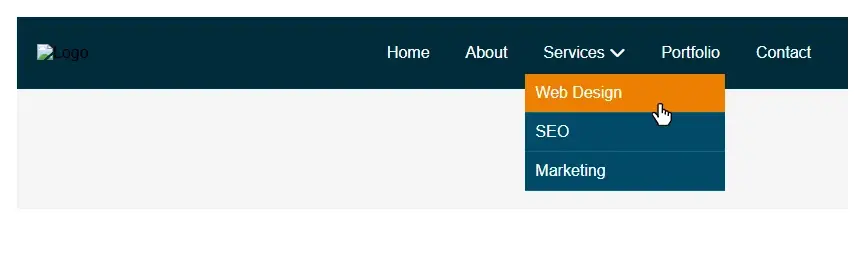
<header>
<nav class="nav-container">
<div class="logo">
<img src="assets/logo.png" alt="Logo">
</div>
<button class="menu-toggle">
<i class="fas fa-bars"></i>
</button>
<ul class="nav-menu">
<li><a href="#">Home</a></li>
<li><a href="#">About</a></li>
<li class="dropdown">
<a href="#">Services <i class="fas fa-chevron-down"></i></a>
<ul class="dropdown-menu">
<li><a href="#">Web Design</a></li>
<li><a href="#">SEO</a></li>
<li><a href="#">Marketing</a></li>
</ul>
</li>
<li><a href="#">Portfolio</a></li>
<li><a href="#">Contact</a></li>
</ul>
</nav>
</header>
</body>
</html>Create a style.css file and apply the following styles:
/* Default */
* {
margin: 0;
padding: 0;
box-sizing: border-box;
}
body {
font-family: Arial, sans-serif;
background-color: #f4f4f4;
}
/* Navigation */
.nav-container {
display: flex;
justify-content: space-between;
align-items: center;
background: #012b3b;
padding: 15px 20px;
position: relative;
}
.logo img {
height: 50px;
}
/* Menu Items */
.nav-menu {
display: flex;
list-style: none;
}
.nav-menu li {
position: relative;
}
.nav-menu a {
text-decoration: none;
color: white;
padding: 12px 18px;
display: block;
transition: background 0.3s;
}
.nav-menu a:hover {
background: #ec7f03;
}
/* Dropdown Menu */
.dropdown-menu {
position: absolute;
left: 0;
top: 100%;
background: #034a69;
min-width: 200px;
list-style: none;
display: none;
}
.dropdown-menu li {
border-bottom: 1px solid #0b6688;
}
.dropdown-menu a {
padding: 10px;
color: white;
}
.dropdown:hover .dropdown-menu {
display: block;
}
.menu-toggle {
display: none;
font-size: 24px;
background: none;
border: none;
color: white;
cursor: pointer;
}
/* Responsive Menu */
@media screen and (max-width: 767px) {
.nav-menu {
display: none;
flex-direction: column;
width: 100%;
background: #012b3b;
position: absolute;
top: 60px;
left: 0;
z-index: 100;
}
.nav-menu.show {
display: flex;
}
.dropdown-menu {
position: relative;
display: block !important;
background: none;
padding-left: 20px;
}
.dropdown-menu li {
border: none;
}
.dropdown-menu a {
padding-left: 25px;
}
.menu-toggle {
display: block;
}
}We only need jQuery to toggle the mobile menu, since the dropdowns will always remain open below 767px.
$(document).ready(function () {
// Toggle mobile menu
$(".menu-toggle").click(function () {
$(".nav-menu").toggleClass("show");
});
// Hide menu when clicking outside
$(document).click(function (event) {
if (!$(event.target).closest("nav").length) {
$(".nav-menu").removeClass("show");
}
});
});This fully responsive navigation menu:
A responsive navigation menu enhances user experience, making it easy to navigate across different screen sizes.
With mobile-first indexing becoming increasingly important, ensuring proper navigation usability is a must. This tutorial showcased a modern dropdown menu that:
By following this comprehensive guide, you can create a mobile-friendly dropdown navigation menu that is stylish, functional, and effective across all devices, ensuring an optimal and seamless user experience.
In modern web design, customizing bullet points for unordered and ordered lists can significantly enhance the visual appeal and user experience of a website. While default
Enhancing user interaction on your WordPress blog is crucial, and integrating a contact form is a fundamental step. A contact form not only facilitates seamless communication
In modern web development, enhancing user interaction through dynamic effects is essential. jQuery is a powerful library that simplifies the process of adding these effects,
Typography is a cornerstone of effective web design, and integrating custom Google Fonts into your WordPress site can transform its visual appeal. This comprehensive guide
The if, else, and elseif constructs allow for decision-making in code by executing different blocks based on specified conditions. The switch statement streamlines handling
User interaction pseudo-classes in CSS allow developers to apply styles dynamically based on how users interact with elements. They enable changes when a user hovers, clicks,
Loops are an essential part of PHP web development, allowing programmers to execute repetitive tasks efficiently. Instead of writing the same code multiple times, loops help
HTML5 is the backbone of modern web development, providing a structured and semantic way to create web pages. However, many beginner developers unknowingly write incorrect
Our online CSS beautifier & minifier is the professional choice for clean code. It offers customizable options for formatting, beautification, and minification. Enhance your CSS for optimal results now!
Our online HTML beautifier is the professional choice for cleaning up code. Compress & format HTML for improved structure and readability, with just a few clicks. Start beautifying today!
Design unique CSS gradients with our easy to use, professional generator. Choose colors and customize with advanced features. Lightweight for fast and optimized output!
Use our powerful sort words tool to arrange text by alphabetical order or character length. Many options available to format the output as desired. Clean up your lists now, quickly and easily!
Professional-grade text encoding and decoding is here with our advanced tool. Sophisticated features and capabilities for all your complex data transformation needs. Start now!
Our lightweight CSS filter generator lets you create CSS filters using hex values with multiple advanced options. Get the perfect look for your elements with this powerful & efficient tool!
Extract email IDs from messy text with a single click using our professional tool. Lightweight & efficient, streamlines the process for you, saving time. Try now for effortless email extraction!
Our online Lorem Ipsum generator provides the best solution for your demo content needs. It offers many options, allowing you to create perfect placeholder text with precision. Get started now!
Our Website Development Service offers custom, responsive design, ensuring seamless user experience across devices. From concept to launch, we create dynamic, SEO-friendly sites to elevate your online presence and drive engagement.
Revamp your online presence with our Website Redesign Service! We specialize in creating modern, user-friendly designs that boost engagement and conversion rates. Transform your site today for a sleek, professional look that stands out.
Transform your PSD designs into pixel-perfect, responsive HTML5 code with our professional PSD to HTML5 conversion service. Enjoy clean, SEO-friendly, and cross-browser compatible code tailored to bring your vision to life seamlessly.
Elevate your brand with our professional Logo Design Service. We create unique, memorable logos that capture your business's essence. Stand out in the market with a custom logo designed to leave a lasting impression.
Boost your site's search engine presence! We offer expert SEO solutions, including image and code enhancements, to achieve top positions on Google, Bing, and Yahoo. Let us drive qualified traffic to your business today!
Boost your brand with our Social Media Marketing Service! We specialize in crafting engaging content, driving growth through targeted ads, and maximizing your online presence. Drive growth and connect with your audience effectively.
Experience our WordPress development services, offering tailored solutions for custom themes, plugins, and seamless integrations. Enhance your online presence with our responsive, secure, and success-optimized WordPress solutions.
Enhance your website's visual appeal: We sharpen icons/images, correct RAW files & repair damaged/distorted/overly bright photos. Expect natural-colored, high-resolution JPEGs, complete with photographic effects & upscaling.

In the age of machine learning and smart algorithms, the lines between human creativity and artificial intelligence are blurring—fast. With tools like ChatGPT, Jasper, and Writesonic popping up everywhere, the content landscape is...

Boost Your SEO Rankings: Master UI Design Optimization for Higher Visibility In the digital age, SEO success isn’t just about keywords and backlinks. Google’s algorithms now prioritize user experience (UX), making your website’s User Interface...
What Are JavaScript Libraries? JavaScript libraries are pre-written collections of code that streamline complex web development tasks. They provide reusable functions, components, and utilities to handle everything from DOM manipulation to 3D rendering,...
In the dynamic world of web development, the visual appeal and user experience of a website are paramount. At the heart of this lies CSS (Cascading Style Sheets), the language that dictates how...
In today's digital landscape, a stunning and functional website is no longer a luxury but a necessity. Whether you're an aspiring web designer, a budding entrepreneur, or a seasoned professional looking to sharpen...

AI is fundamentally reshaping website development, automating tedious tasks, enabling hyper-personalization, and accelerating development cycles, which presents both immense opportunities for those who adapt and significant risks for developers who ignore this technological...

Choosing the right server infrastructure is one of the most critical decisions any business or individual with an online presence will make. Get it right, and you have a stable, performant foundation for...

In the fast-paced world of web development, efficiency and productivity are paramount. For PHP developers, the choice of a code editor can significantly impact their workflow, making the difference between a cumbersome coding...

