


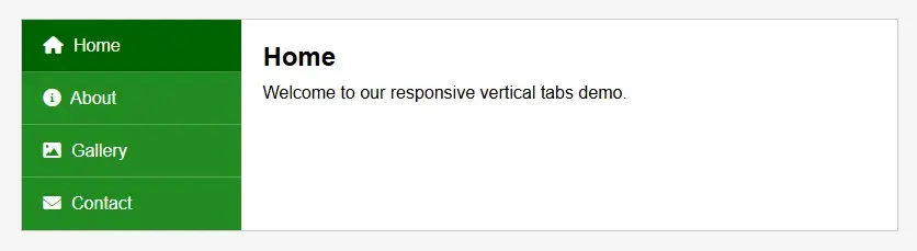
In today’s modern web development landscape, delivering interactive and responsive interfaces is key to engaging users. In this tutorial, we’ll build a vertical tab component that not only responds to different screen sizes but also incorporates smooth, dynamic animations using jQuery. The final design features a forest green color scheme, with Font Awesome icons integrated into the tabs, and a clean, professional look. Whether you’re a beginner or an intermediate developer, this step-by-step guide will help you understand the process from scratch.
By the end of this tutorial, you will have learned to:
Let’s dive into the process.
A robust project starts with well-organized HTML. Here, we create a container for both the tab buttons and the corresponding content panels. Each tab is represented by a <button> element that contains an icon (using Font Awesome) and a label. The data-target attribute on each button connects it to the corresponding content panel via its ID.
Below is the HTML code with tab-based indentation for clarity:
<!DOCTYPE html>
<html lang="en">
<head>
<meta charset="UTF-8">
<title>Responsive Vertical Tabs with Animation</title>
<link rel="stylesheet" href="https://cdnjs.cloudflare.com/ajax/libs/font-awesome/6.0.0-beta3/css/all.min.css">
<link rel="stylesheet" href="styles.css">
</head>
<body>
<div class="tab-container">
<div class="tabs">
<button class="tab active" data-target="content1"><i class="fas fa-home"></i> Home</button>
<button class="tab" data-target="content2"><i class="fas fa-info-circle"></i> About</button>
<button class="tab" data-target="content3"><i class="fas fa-image"></i> Gallery</button>
<button class="tab" data-target="content4"><i class="fas fa-envelope"></i> Contact</button>
</div>
<div class="tab-content">
<div class="content active" id="content1">
<h2>Home</h2>
<p>Welcome to our responsive vertical tabs demo.</p>
</div>
<div class="content" id="content2">
<h2>About</h2>
<p>Learn more about our responsive vertical tabs with smooth animation.</p>
</div>
<div class="content" id="content3">
<h2>Gallery</h2>
<p>Check out our image gallery with responsive design and animation effects.</p>
</div>
<div class="content" id="content4">
<h2>Contact</h2>
<p>Get in touch with us via our responsive contact form.</p>
</div>
</div>
</div>
<script src="https://code.jquery.com/jquery-3.6.0.min.js"></script>
<script src="scripts.js"></script>
</body>
</html>Next, we focus on styling the tab interface. The design features a fixed-width sidebar for the tabs with a forest green background and a content area that adapts to 100% of its container’s width. We have sorted the CSS properties alphabetically within each rule block to maintain clarity and consistency.
Below is the CSS code (saved as styles.css):
* {
box-sizing: border-box;
margin: 0;
padding: 0;
}
body {
background-color: #f5f5f5;
font-family: Arial, sans-serif;
padding: 20px;
}
.tab-content h2 {
margin-bottom: 10px;
}
.tab-container {
background: #fff;
border: 1px solid #ccc;
display: flex;
margin: 0 auto;
max-width: 800px;
overflow: hidden;
width: 100%;
}
.tabs {
background-color: #228B22;
width: 200px;
}
.tabs button {
background: none;
border: none;
border-bottom: rgba(255, 255, 255, 0.2);
color: #fff;
cursor: pointer;
display: block;
font-size: 16px;
outline: none;
padding: 15px 20px;
position: relative;
text-align: left;
transition: background 0.3s;
width: 100%;
}
.tabs button::before {
content: '';
position: absolute;
bottom: 0;
left: 0;
width: 100%;
height: 1px;
background-color: rgba(255, 255, 255, 0.25);
}
.tabs button:last-child::before {
display: none;
}
.tabs button:hover {
background-color: #006400;
}
.tabs button.active {
background-color: #006400;
}
.tabs i {
margin-right: 5px;
}
.tab-content {
flex: 1;
position: relative;
}
.tab-content .content {
display: none;
left: 0;
padding: 20px;
position: absolute;
top: 0;
width: 100%;
}
.tab-content .content.active {
display: block;
}
/* Responsive Styles */
@media (max-width: 767px) {
.tab-container {
flex-direction: column;
}
.tabs {
width: 100%;
}
.tabs button {
text-align: center;
}
.tab-content .content {
position: static;
}
}Sorting the CSS properties alphabetically within each block not only improves code maintainability but also ensures that any developer reviewing the code can quickly find specific properties.
The dynamic aspect of our vertical tabs is powered by jQuery. The script listens for click events on each tab button and then applies a smooth fade-in and slide-up animation to the associated content panel. The animation effect is created by first positioning the new content 20 pixels down with zero opacity and then animating it to its final position with full opacity.
Below is the jQuery code (saved as scripts.js):
$(document).ready(function() {
$('.tabs button').click(function() {
if ($(this).hasClass('active')) {
return;
}
var target = $(this).attr('data-target');
$('.tabs button').removeClass('active');
$(this).addClass('active');
$('.tab-content .content').removeClass('active').css({ display: 'none' });
// Show the target content panel with an animation.
$('#' + target)
.css({ opacity: 0, top: '20px' })
.addClass('active')
.css({ display: 'block' })
.animate({ opacity: 1, top: '0' }, 300);
});
});This concise yet effective jQuery logic is central to making the tabs feel interactive and responsive.
When creating interactive UI components like tabs, consider adding ARIA (Accessible Rich Internet Applications) attributes. For example:
These enhancements improve accessibility for users who rely on screen readers or keyboard navigation.
While the current jQuery animation provides a pleasant user experience, you can experiment with additional effects such as easing functions or even combine multiple animations. Libraries like Animate.css or jQuery UI can offer extended animation capabilities for more complex projects.
For larger applications, consider loading content dynamically via AJAX when a tab is activated. This approach is especially useful if the content panels are heavy or if you need to fetch updated information without reloading the page.
Allowing end users or clients to customize the appearance (such as colors or animation speeds) can make your component more versatile. For example, you might implement a settings panel where users can select different themes or toggle animations on or off.
Even though jQuery is great for dynamic interfaces, remember that search engines favor semantic, crawlable HTML. Ensure that your content panels have semantic markup (like proper heading tags) so that the content is accessible to both users and search engines. Clean, well-documented code not only boosts SEO but also makes maintenance easier.
In this tutorial, we have demonstrated how to create responsive vertical tabs with smooth animations using HTML, CSS, and jQuery. We began by building a semantic HTML structure, moved on to crafting a well-organized and responsive CSS layout (with properties sorted alphabetically), and finally implemented a simple yet effective jQuery script to animate the content transitions.
By applying these techniques and best practices, you’re well-equipped to build more sophisticated, interactive web components. Experiment with additional features like dynamic content loading, customizable themes, or more advanced animations to further enhance your project.
Happy coding, and may your future projects be as dynamic and user-friendly as these responsive vertical tabs!
Photoshop brushes are powerful tools for digital artists, enabling them to mimic traditional painting techniques and create unique textures. Whether you're designing
Layer styles are the secret weapon of many professional designers, offering a quick and effective way to add depth, texture, and dimension to your artwork. Whether you’re
WordPress automatically adds several meta tags, scripts, and links to your website’s section. While some of these are useful for specific functionalities, many are
Image zoom effects are widely used in modern web development to enhance user experience. They provide a detailed view of images without requiring users to open a separate
Typography is a cornerstone of effective web design, and integrating custom Google Fonts into your WordPress site can transform its visual appeal. This comprehensive guide
WordPress is a powerful content management system, but out of the box, it includes features that can have a performance impact—especially on high-traffic websites or those
Adobe Illustrator is a powerful vector graphics editor that offers a wide range of tools and features to help designers create precise and visually appealing artwork. In this
The Illustrator Pen Tool is one of the most powerful and versatile tools available in Adobe Illustrator. Located in the left-side toolbar, this tool allows you to create
Our online CSS beautifier & minifier is the professional choice for clean code. It offers customizable options for formatting, beautification, and minification. Enhance your CSS for optimal results now!
Our online HTML beautifier is the professional choice for cleaning up code. Compress & format HTML for improved structure and readability, with just a few clicks. Start beautifying today!
Design unique CSS gradients with our easy to use, professional generator. Choose colors and customize with advanced features. Lightweight for fast and optimized output!
Use our powerful sort words tool to arrange text by alphabetical order or character length. Many options available to format the output as desired. Clean up your lists now, quickly and easily!
Professional-grade text encoding and decoding is here with our advanced tool. Sophisticated features and capabilities for all your complex data transformation needs. Start now!
Our lightweight CSS filter generator lets you create CSS filters using hex values with multiple advanced options. Get the perfect look for your elements with this powerful & efficient tool!
Extract email IDs from messy text with a single click using our professional tool. Lightweight & efficient, streamlines the process for you, saving time. Try now for effortless email extraction!
Our online Lorem Ipsum generator provides the best solution for your demo content needs. It offers many options, allowing you to create perfect placeholder text with precision. Get started now!
Our Website Development Service offers custom, responsive design, ensuring seamless user experience across devices. From concept to launch, we create dynamic, SEO-friendly sites to elevate your online presence and drive engagement.
Revamp your online presence with our Website Redesign Service! We specialize in creating modern, user-friendly designs that boost engagement and conversion rates. Transform your site today for a sleek, professional look that stands out.
Transform your PSD designs into pixel-perfect, responsive HTML5 code with our professional PSD to HTML5 conversion service. Enjoy clean, SEO-friendly, and cross-browser compatible code tailored to bring your vision to life seamlessly.
Elevate your brand with our professional Logo Design Service. We create unique, memorable logos that capture your business's essence. Stand out in the market with a custom logo designed to leave a lasting impression.
Boost your site's search engine presence! We offer expert SEO solutions, including image and code enhancements, to achieve top positions on Google, Bing, and Yahoo. Let us drive qualified traffic to your business today!
Boost your brand with our Social Media Marketing Service! We specialize in crafting engaging content, driving growth through targeted ads, and maximizing your online presence. Drive growth and connect with your audience effectively.
Experience our WordPress development services, offering tailored solutions for custom themes, plugins, and seamless integrations. Enhance your online presence with our responsive, secure, and success-optimized WordPress solutions.
Enhance your website's visual appeal: We sharpen icons/images, correct RAW files & repair damaged/distorted/overly bright photos. Expect natural-colored, high-resolution JPEGs, complete with photographic effects & upscaling.
In the age of machine learning and smart algorithms, the lines between human creativity and artificial intelligence are blurring—fast. With tools like ChatGPT, Jasper, and Writesonic popping up everywhere, the content landscape is...

Boost Your SEO Rankings: Master UI Design Optimization for Higher Visibility In the digital age, SEO success isn’t just about keywords and backlinks. Google’s algorithms now prioritize user experience (UX), making your website’s User Interface...
What Are JavaScript Libraries? JavaScript libraries are pre-written collections of code that streamline complex web development tasks. They provide reusable functions, components, and utilities to handle everything from DOM manipulation to 3D rendering,...
In the dynamic world of web development, the visual appeal and user experience of a website are paramount. At the heart of this lies CSS (Cascading Style Sheets), the language that dictates how...
In today's digital landscape, a stunning and functional website is no longer a luxury but a necessity. Whether you're an aspiring web designer, a budding entrepreneur, or a seasoned professional looking to sharpen...
AI is fundamentally reshaping website development, automating tedious tasks, enabling hyper-personalization, and accelerating development cycles, which presents both immense opportunities for those who adapt and significant risks for developers who ignore this technological...

Choosing the right server infrastructure is one of the most critical decisions any business or individual with an online presence will make. Get it right, and you have a stable, performant foundation for...
In the fast-paced world of web development, efficiency and productivity are paramount. For PHP developers, the choice of a code editor can significantly impact their workflow, making the difference between a cumbersome coding...

