


Creating a visually appealing and responsive website layout is crucial for delivering a great user experience across all devices. In this tutorial, we will master the art of responsive web design using CSS Flexbox, specifically focusing on styling a two-column layout for image and text content. You will learn how to build a clean, efficient, and adaptable design that works seamlessly from desktops to mobile devices.
Responsive web design ensures your website looks and functions well on a variety of devices, from large desktop monitors to small smartphone screens. Flexbox, or the Flexible Box Layout Module, is a powerful CSS layout tool that makes it easier to design flexible responsive layouts without the complexity of floats or positioning hacks.
With Flexbox, containers can dynamically adjust the size, position, and alignment of their child elements. This makes it ideal for building layouts like two-column designs that adapt smoothly to different screen sizes.
Before diving into the code, let’s briefly cover the core concepts behind CSS Flexbox and responsive design.
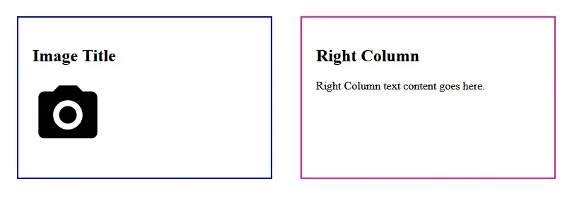
Here’s the HTML code for the two-column layout. It consists of a parent container (flex-container) and two child divs representing the left and right columns.
<!DOCTYPE html>
<html>
<head>
<title>Flex Two Column Layout</title>
<link rel="stylesheet" href="styles.css" />
</head>
<body>
<!-- Flex container wrapping both columns -->
<div class="flex-container">
<!-- Left column for image and title -->
<div class="flex-left">
<h2>Image Title</h2>
<p><img src="https://github.com/Templarian/MaterialDesign/raw/master/svg/camera.svg" width="100" height="100" alt="Camera Icon" />
</p>
</div>
<!-- Right column for text content -->
<div class="flex-right">
<h2>Right Column</h2>
<p>Right Column text content goes here.</p>
</div>
</div>
</body>
</html>Now, let’s add styles to the layout to achieve the desired two-column responsive design. Below is the exact CSS code with inline comments for better understanding:
/* Container for the two columns */
.flex-container {
box-sizing: border-box;
display: flex;
flex-direction: row;
gap: 50px;
justify-content: space-between;
padding: 30px;
}
/* Common styles for both left and right columns */
.flex-left,
.flex-right {
box-sizing: border-box;
flex: 0 0 auto;
padding: 20px;
width: calc(50% - 20px);
}
/* Left column specific styling */
.flex-left {
border: 2px solid blue;
}
/* Right column specific styling */
.flex-right {
border: 2px solid deeppink;
}
/* Medium screen adjustments (tablets, small laptops) */
@media (max-width: 1199px) {
.flex-container {
gap: 20px;
padding: 20px;
}
}
/* Small screen adjustments (mobile phones) */
@media (max-width: 767px) {
.flex-container {
flex-direction: column;
gap: 20px;
padding: 10px;
}
.flex-left,
.flex-right {
font-size: 16px;
padding: 15px;
width: 100%;
}
}This ensures the two-column layout looks great on desktop, tablet, and mobile screens.
When designing responsive layouts with Flexbox, consider the following best practices:
Organize your content logically with meaningful tags (<section>, <article>, <header>, <footer>). In our example, using descriptive classes like .flex-left and .flex-right helps maintain clarity.
This setting makes element sizing more intuitive by including padding and border inside width/height calculations.
Instead of fixed pixel widths, use relative units like % or calc() to keep layouts flexible.
Start with a desktop-first approach and add media queries for smaller screens to adjust layout and spacing, improving usability on all devices.
Make sure your layout works well on various screen sizes and browsers. Responsive design is not just about shrinking content but ensuring usability and readability.
Use appropriate image sizes and formats to reduce load times without sacrificing quality. In this tutorial, we used an SVG icon for crispness and scalability.
Building a responsive two-column layout for image and text content is straightforward with CSS Flexbox. By following this tutorial:
This approach sets a strong foundation for modern responsive web design, allowing you to scale your skills and layouts with confidence.
Feel free to experiment further by adding more content, changing images, or customizing styles to suit your project needs!
Learn how to master the Rotate Tool in Adobe Illustrator to create stunning designs with ease. This detailed guide will cover the process of duplicating, transforming, and
HTML5 introduced a set of semantic elements that provide meaning to the structure of web pages. Unlike non-semantic elements like and , which tell us nothing about their
PHP Output Buffering is an essential feature in PHP Web Development that helps developers manage and manipulate output before sending it to the browser. It allows capturing
In modern HTML and CSS development, keeping two divs side by side is a fundamental layout requirement. Whether you're building a responsive website or a fixed-width layout,
As PHP evolves, certain functions become outdated and are eventually deprecated. This means they are no longer recommended for use because they may be removed in future
PHP is one of the most widely used languages for web development, and MySQL is a powerful open-source relational database management system (RDBMS). Establishing a secure and
In today’s fast-paced world of WordPress web development, ensuring your website is free from coding errors is essential for a smooth user experience and optimal
Adobe Illustrator is a powerful vector graphics editor that offers a wide range of tools and features to help designers create precise and visually appealing artwork. In this
Our online CSS beautifier & minifier is the professional choice for clean code. It offers customizable options for formatting, beautification, and minification. Enhance your CSS for optimal results now!
Our online HTML beautifier is the professional choice for cleaning up code. Compress & format HTML for improved structure and readability, with just a few clicks. Start beautifying today!
Design unique CSS gradients with our easy to use, professional generator. Choose colors and customize with advanced features. Lightweight for fast and optimized output!
Use our powerful sort words tool to arrange text by alphabetical order or character length. Many options available to format the output as desired. Clean up your lists now, quickly and easily!
Professional-grade text encoding and decoding is here with our advanced tool. Sophisticated features and capabilities for all your complex data transformation needs. Start now!
Our lightweight CSS filter generator lets you create CSS filters using hex values with multiple advanced options. Get the perfect look for your elements with this powerful & efficient tool!
Extract email IDs from messy text with a single click using our professional tool. Lightweight & efficient, streamlines the process for you, saving time. Try now for effortless email extraction!
Our online Lorem Ipsum generator provides the best solution for your demo content needs. It offers many options, allowing you to create perfect placeholder text with precision. Get started now!
Our Website Development Service offers custom, responsive design, ensuring seamless user experience across devices. From concept to launch, we create dynamic, SEO-friendly sites to elevate your online presence and drive engagement.
Revamp your online presence with our Website Redesign Service! We specialize in creating modern, user-friendly designs that boost engagement and conversion rates. Transform your site today for a sleek, professional look that stands out.
Transform your PSD designs into pixel-perfect, responsive HTML5 code with our professional PSD to HTML5 conversion service. Enjoy clean, SEO-friendly, and cross-browser compatible code tailored to bring your vision to life seamlessly.
Elevate your brand with our professional Logo Design Service. We create unique, memorable logos that capture your business's essence. Stand out in the market with a custom logo designed to leave a lasting impression.
Boost your site's search engine presence! We offer expert SEO solutions, including image and code enhancements, to achieve top positions on Google, Bing, and Yahoo. Let us drive qualified traffic to your business today!
Boost your brand with our Social Media Marketing Service! We specialize in crafting engaging content, driving growth through targeted ads, and maximizing your online presence. Drive growth and connect with your audience effectively.
Experience our WordPress development services, offering tailored solutions for custom themes, plugins, and seamless integrations. Enhance your online presence with our responsive, secure, and success-optimized WordPress solutions.
Enhance your website's visual appeal: We sharpen icons/images, correct RAW files & repair damaged/distorted/overly bright photos. Expect natural-colored, high-resolution JPEGs, complete with photographic effects & upscaling.
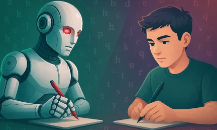
In the age of machine learning and smart algorithms, the lines between human creativity and artificial intelligence are blurring—fast. With tools like ChatGPT, Jasper, and Writesonic popping up everywhere, the content landscape is...

Boost Your SEO Rankings: Master UI Design Optimization for Higher Visibility In the digital age, SEO success isn’t just about keywords and backlinks. Google’s algorithms now prioritize user experience (UX), making your website’s User Interface...
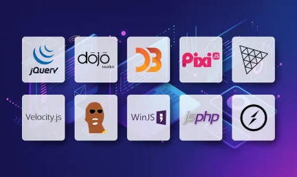
What Are JavaScript Libraries? JavaScript libraries are pre-written collections of code that streamline complex web development tasks. They provide reusable functions, components, and utilities to handle everything from DOM manipulation to 3D rendering,...
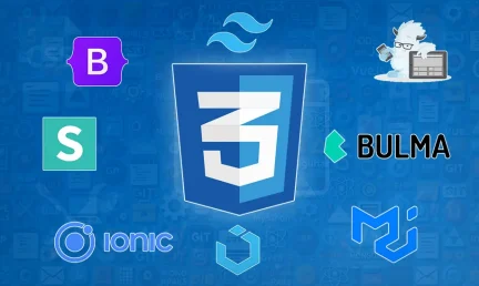
In the dynamic world of web development, the visual appeal and user experience of a website are paramount. At the heart of this lies CSS (Cascading Style Sheets), the language that dictates how...
In today's digital landscape, a stunning and functional website is no longer a luxury but a necessity. Whether you're an aspiring web designer, a budding entrepreneur, or a seasoned professional looking to sharpen...

AI is fundamentally reshaping website development, automating tedious tasks, enabling hyper-personalization, and accelerating development cycles, which presents both immense opportunities for those who adapt and significant risks for developers who ignore this technological...

Choosing the right server infrastructure is one of the most critical decisions any business or individual with an online presence will make. Get it right, and you have a stable, performant foundation for...
In the fast-paced world of web development, efficiency and productivity are paramount. For PHP developers, the choice of a code editor can significantly impact their workflow, making the difference between a cumbersome coding...

